
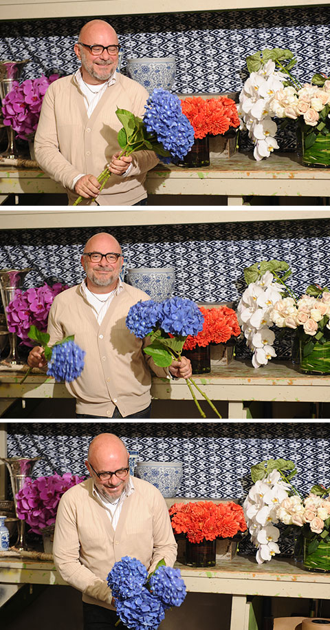
You know those bouquets you see in magazines or shop windows that just look perfect? The colors belong together, the greenery mixes with the blossoms and the scale is just right? Somehow we can never recreate that at home, as hard as we try. When A-listers — think Madonna and Maria Shriver — and West Coast fashion folks are looking for that indescribably chic wow factor, they are wise enough to outsource it. The first call they make is to a man who famously works out of the basement of the Four Seasons at Beverly Hills: floral designer Eric Buterbaugh. Here, he talks about how he makes his magic, and shares some expert tips.
Arrangement tips when it comes to color…
For me I never like too many colors — it seems like a fruit salad with too many ingredients. I love monochromatic combinations, and I also love hot colors with hot colors and softer colors with softer colors, like hot pink with bright orange or white with soft pink.
Colors that go best together…
In the fall, I love the combination of burnt orange with muted yellows and peach.
Favorite bouquets for the season…
More leaves and greenery than other times of the year, giving that autumnal feel.
In an arrangement, I’d never mix…
I personally do not like vegetables mixed with flowers. For me, food is to eat and flowers are natures gorgeous treasures to see.
When it comes to the meaning of arrangement colors…
I don’t really prescribe to colors of flowers meaning things — with the exception of red roses meaning love. In historical times every flower and every color meant something, but in current times I think the trend is to choose a flower or color of flower that you know someone likes.
Tips for planting a flower bed…
I love lots of bulk of one item. It is so much more powerful than loads of different varieties all over the place — then accent with something complementary. I also love one or two colors in a more monochromatic way.
And for creating party decor…
I start with the tent, then the tables, then fill in the flowers and décor elements. I also take into consideration what the party is for, what the goal of the evening is — e.g. a cozy romantic dinner or an evening that gets wilder with dancing — and bring all the elements into the mix.
The artists whose color use most influences my work…
I am very inspired by Rothko, whose use of monochromatic color combinations is unparalleled. His work really resonates with me.
And the garden whose colors I most admire…
The Tuileries in Paris. First, the layout is so balanced which you “feel.” Second, the planting of the trees and shrubs in different shades of green is amazing. Whenever I am in a garden, I squint my eyes just to see the different tones of greens. There are so many and when planted well they give such depth of color. Also this garden has so many little secret areas that you always find — accented with a bit of color or all white flowers, usually wonderful sculpture… I love it.
More to explore in Entertaining
-
 Entertaining
5.27.25
The Power of Flowers
Entertaining
5.27.25
The Power of Flowers
-
 Entertaining
5.12.23
A Bakery Inspired by Maman
Entertaining
5.12.23
A Bakery Inspired by Maman
-
 Entertaining
2.10.23
Where to Eat During NYFW
Entertaining
2.10.23
Where to Eat During NYFW
-
 Entertaining
12.14.22
The Ultimate Cheeseboard with Clara Diez
Entertaining
12.14.22
The Ultimate Cheeseboard with Clara Diez
-
 Entertaining
11.14.22
Tory Daily 10: Host with the Most
Entertaining
11.14.22
Tory Daily 10: Host with the Most