How do you translate the physical experience of flipping through the pages of a glossy magazine into an equally appealing, visually exciting digital format? Condé Nast’s VP, Editorial Platforms and Design, faces on a daily basis.
How has the digital revolution changed publishing?
The past few years have really been a whirlwind of change. Tablet devices like the iPad, Fire and Nook have opened up entirely new ways of making, distributing and reading magazines, and that progress is only going to accelerate with the arrival of the Nexus 7 and Surface tablets. At Condé Nast, we embraced the idea of digital editions on day one, and it’s clear that our readers are also very enthusiastic about these products. In fact, some brands have digital readerships that rival — or beat — traditional newsstand sales. The scale and speed of this change is pretty remarkable, and I think we’ve been able to thrive in this environment because of the meaningful relationships we’ve formed with tech partners like Apple, Adobe, Amazon, Google and Microsoft. But it’s not all about tablets; our magazine websites continue to scale their readerships by orders of magnitude and mobile traffic is absolutely through the roof. What was once a print magazine is now a full branded content experience across devices, channels and media. Bottom line, it’s an extraordinarily exciting time to be in media, and digital opportunities are at the heart of this growth.
The key to translating print to a digital format is…
Two words: design fidelity. We talk about this a lot, but I can’t overstate the importance of great design in our products. This is a company that was founded on and flourishes because of the premium we put on experience. Condé Nast employs the best writers, editors, photographers and designers in media, and it’s absolutely crucial that no matter the product — ink on paper or pixels under glass — be superlative in execution, and design is the fundamental constant. But it’s not just about translating print for digital. The vast majority of the time, digital products require independent thinking and we like to describe that movement across substrates as a reimagining. We do that work every time we make a digital product. Sometimes it’s quite difficult and sometimes the process is really liberating.
Next big digital thing?
My colleagues and I have just spent the better part of a year working with The New Yorker on its new iPhone app. We’re all very excited about it. Subscribers now get every story and every cartoon — the full issue — every Monday on their phone. Lena Dunham and I made a little viral video with Jon Hamm to announce its arrival. I think it’s a gorgeous app — unlike anything that’s come before it — and I think the first great expression of a full magazine issue in a smartphone format. Wyatt Mitchell is the creative director there; his design is very smart. Beyond mobile, we’re working closely with Dawn Ostroff and her team at Condé Nast Entertainment as we think about digital video products, which will be significant innovation opportunities, both for our company and the publishing industry as a whole.
My favorite apps are…
I can’t live without my New Yorker iPad app. Twitter is my must-read every morning. Martha Stewart Craft Studio is one of the best creativity apps out there — I can’t believe how much fun I’m having with it. I love FFFFound for design inspiration and Planetary for music, but without a doubt, Instagram is my all-time favorite app.
The first blogs I read when I wake up are…
I’m a progressive, but I check Drudge Report every morning. Gizmodo, Engadget, The Verge, Vulture and Gawker are must-reads.
My design icons are…
George Lois, Jony Ive, Thomas Heatherwick, Alex McDowell, Walter de’Silva, Doug Aitken, Stephen Doyle, Gael Towey, Fred Woodward, Alexey Brodovitch, Max Huber, Otl Aicher, Dev Harlan, Chip Kidd, DJ Stout, Jonathan Hoefler, Tobias Frere-Jones, Paula Scher, Andreas Gursky, Christoph Niemann, Bill Cahan and Alexander Liberman.
My personal style is…
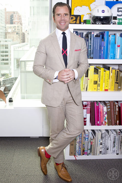
I think it’s fair to say that my style is a little odd. I like bold colors and pattern mixing but am certainly influenced by traditionally American styles. I really admire and wear a lot of Ralph Lauren’s clothes, but lately, I’ve fallen in love with Neapolitan suits, both for their comfort and beautiful lines. Nedo Bellucci makes all of my suits and jackets, and I will be forever spoiled by his attention to detail. In concert, my design mind loves the daily challenge of interesting shirt-tie combinations, though I can really ruin a day when I realize mid-morning I’ve made the wrong choice. For years, I’ve been trying to find just the right line of ties — statement pieces that can carry a lot of detail, form and color. I still haven’t found designs that fit the bill, so earlier this year, my wife and I decided to start our own men’s luxury accessories company: Mookie Sullivan. We’re starting with ties this fall and I’m excited to see where we can take it.
I still love print magazines because…
There really is no replacement for the excitement of holding a gorgeous new print magazine in your hands, especially one that’s got exquisite production values. Gorgeous paper, foil stamping, glossy cover stock — all of the physical attributes of a beautifully made magazine have always been very appealing to me. I love magazines like Port, GQ and The Hollywood Reporter for this very reason — because they feel so great. They pay attention to the tactile elements and physical ingredients that some magazines ignore, and I think as digital circulation continues to climb, those differentiating production values are going to matter more, not less.
More to explore in Experts
-
 Experts
3.29.19
Equal Pay Day
-
 Experts
12.24.18
5 Ways to Dial Down Holiday Stress
-
 Experts
11.12.18
Astrologer Susan Miller On: Gifts for Sagittarius, Capricorn, Aquarius and Pisces
-
 Experts
11.12.18
Astrologer Susan Miller On: Gifts for Aries, Taurus, Gemini and Cancer
-
 Experts
11.12.18
Astrologer Susan Miller On: Gifts for Leo, Virgo, Libra and Scorpio
